Building Web Site

  • Subscribe to our RSS feed.
  • Twitter
  • StumbleUpon
  • Reddit
  • Facebook
  • Digg

Tuesday, 18 January 2011

The Wild Side

Posted on 00:36 by Unknown
-By Dan dos Santos


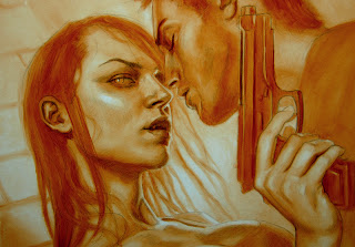
A little while ago I was commissioned to do the cover to an Urban Fantasy anthology called 'The Wild Side'. One of the great things about anthologies is that you tend to have a lot more freedom with the subject matter, since you need to capture the flavor of multiple stories. In this case, the Art Director gave me an unprecedented amount freedom, and let me do whatever I wanted, provided that the image screamed of 'urban fantasy' and had a strong sex appeal.


I actually struggled with the concept way more than I thought I would, most likely because I had TOO much freedom... I just didn't know where to start. I am definitely one of those people that comes up with more creative solutions when I have a few restrictions to push against. Eventually I just started drawing every UF cliche I could think of; tattoos, guns, breasts, vampires, alleyways, etc. Before I knew it, this was what came of it.


At the time, I was drooling over Petar Meseldzija's colors, and thought I would try out his process on this piece. He had mentioned to me at IlluXcon that he starts his pieces with a reddish-umber underpainting. Since this was before he had started his blog, I had no idea what color he really meant, so I guessed... It turns out I was WAY off. My underpainting was really saturated, and caused a lot of problems for me, but it also provided me with some unpredictable (and pretty cool) results.


I was able to throw absolute mud on top of the orange underpainting, and it created a very weird sense of depth. The cool/warm contrast made the upper layer absolutely vibrate off the surface. It doesn't come through very well in this photo, but in real life, it almost hurt my eyes.


It took a few coats to finally cool down the faces to where they needed to be. But ultimately, the orange underpainting served me well. I managed to get a really intense sense of light by just letting the underpainting show through.


I knew my composition was going to require some unusual type placement, so I included some sample type in my sketch. The client actually liked it enough, that they decided to let me do the final type as well. That gave me the opportunity to really cater the image to the suit the design, like leaving the forearm area really simple and dropped into shadow so that the type would pop more. It is really rare that I am given this much freedom for a commercial commission.


Email ThisBlogThis!Share to XShare to Facebook
Posted in | No comments
Newer Post Older Post Home

0 comments:

Post a Comment

Subscribe to: Post Comments (Atom)

Popular Posts

  • Eowyn and the Nazgul... Critiques: Round 2
    Thanks for all the kind responses to Friday's crits! Several people mentioned that it is difficult for readers to make comments regar...
  • Power of the brushstroke
      By Petar Meseld ž ija The painting brush is a simple,   yet powerful device. The trace that it leaves upon the canvas is a wonderful pheno...
  • Eowyn and the Nazgul... Critiques: Round 1
    Firstly, let me say... 'Wow'. There have been some amazing submissions to the Art Order Challenge. We will be critiquing some of th...
  • 3-D Art Ready to Print ...Awwwwesome
    No he didn't... Yes he did!!! This is amazing. For more on this piece of awesomeness see article and vid Here Another article with mo...
  • REMINDERS!
    The Alexander McQueen Retrospective 'Savage Beauty', is now up at the Metropolitan Museum of Art, NYC. The show opened last week an...
  • IlluXcon 4 Trailer
    The people at IlluXcon just released a cool trailer for this year's show. The trailer highlights a lot of the demos that take place duri...
  • Robert Fawcett
    by Arnie Fenner Thank God for small presses; fueled almost exclusively by passion and rarely motivated by profit (which is why I buy from th...
  • Road to Legend
    Jesper Ejsing Today I want to continue down the path I was a couple of articles back, The encountering monster road. This illustration is fo...
  • Gooseberry What? Part B
    And let's not forget Down Time Art!!! The creative goodies that happen when you're supposed to be working on Finals but have recogn...
  • Early Art Hero
    One of my early art heroes was Robert Vickery. Next to Andrew Wyeth was one of the premiere practitioners of egg tempera. Sadly Mr. Vickery ...

Categories

  • Justin Gerard

Blog Archive

  • ▼  2011 (131)
    • ►  May (19)
    • ►  April (28)
    • ►  March (28)
    • ►  February (32)
    • ▼  January (24)
      • Look Familiar?
      • A Teaser
      • Francis Ford Coppola: On Risk, Money, Craft & Coll...
      • It's not too late!!!!
      • Inspiration: FASHION
      • Showing At The Society of Illustrators
      • Experimentation
      • Dancing in the woods and other advice.
      • Tips and Tricks from an Art Slave
      • Life Models and the Art They Inspire
      • Over the edge
      • Cover Browser
      • The Wild Side
      • Arts & Letters
      • Walton Ford and Akira Yamaguchi
      • Spotlight On : Peter Ferguson
      • Graphology
      • The Most Mind-Blowing Images I Have Seen in My Lif...
      • Anti-Miracles at the Mütter
      • Not again...
      • Art Competitions - SPECTRUM
      • Getting brave and daring
      • The Three Fates - Nate Furman
      • Ownership
  • ►  2010 (65)
    • ►  December (29)
    • ►  November (24)
    • ►  October (7)
    • ►  September (5)
  • ►  2009 (1)
    • ►  August (1)
Powered by Blogger.

About Me

Unknown
View my complete profile