Building Web Site

  • Subscribe to our RSS feed.
  • Twitter
  • StumbleUpon
  • Reddit
  • Facebook
  • Digg

Wednesday, 3 November 2010

This Way or That?

Posted on 06:00 by Unknown
For me, one of the hardest parts of any assignment is the sketch phase.


Early in my career, I alloted myself far too little time to do concept sketches, thinking that because they are so loose I can do them quickly. When in fact, they are the most important phase of an assignment, and often times demand more time than the final rendering. If I rush a concept, I frequently find myself rendering a piece for days on end, all the while knowing that it will never be successful because my plan was flawed from the start. Over the years, I have learned that lesson the hard way... repeatedly. Now, I try to spend a minimum of 2 full days sketching concepts. If it takes me 4 days before I come up with something good, so be it.


When I sketch, I am not only looking for an interesting image, but for something that really captures the flavor of the story. Of course, everyone's tastes are different, so what I find appropriate does not always work for someone else... most importantly, the Art Director.


Over the course of my career, a lot of sketches that I really loved have fallen by the wayside.

Either the AD felt they did not make as strong of a cover, or would not have been as good for sales, or maybe they just didn't leave enough space for type. Whatever the reason, they get rejected, pushed aside for an alternate concept that simply out-shined them on that particular day.


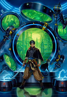
I always tell myself that I will revisit these ideas, but it is very rare that a new assignment comes along where a pre-existing sketch would actually be appropriate for it. So, instead, the sketches sit, as clumps of kilobytes, digital dust-bunnies hiding in some remote corner of my hard drive. For this post, I'd like to dig up some of those sketches, and share with you what some past covers might have been had the AD simply decided to go this way instead of that.


This is the final art and a companion sketch for a novel called 'Doppelgangster'. Both are rather campy and sexy, buy ultimately, I think it was the visual integration of the title that really sold the AD on the chosen concept.


Here is an alternate sketch for 'Implied Spaces'. Since the novel deals a great deal with time travel, I feel the chosen concept definitely captures the story best. Though the mood in the unused concept is a lot more appealing to me and I still regret not getting a chance to paint it.


Lastly, here is a brand new piece for an upcoming Urban Fantasy anthology called 'Naked City'. Fans of Jim Butcher may recognize the guy on the back cover as Harry Dresden, a character which I've had the pleasure of painting 4 or 5 times now for various omnibuses. Below is an alternate concept for the wraparound which wasn't chosen. 


Email ThisBlogThis!Share to XShare to Facebook
Posted in | No comments
Newer Post Older Post Home

0 comments:

Post a Comment

Subscribe to: Post Comments (Atom)

Popular Posts

  • Eowyn and the Nazgul... Critiques: Round 2
    Thanks for all the kind responses to Friday's crits! Several people mentioned that it is difficult for readers to make comments regar...
  • Eowyn and the Nazgul... Critiques: Round 1
    Firstly, let me say... 'Wow'. There have been some amazing submissions to the Art Order Challenge. We will be critiquing some of th...
  • 3-D Art Ready to Print ...Awwwwesome
    No he didn't... Yes he did!!! This is amazing. For more on this piece of awesomeness see article and vid Here Another article with mo...
  • REMINDERS!
    The Alexander McQueen Retrospective 'Savage Beauty', is now up at the Metropolitan Museum of Art, NYC. The show opened last week an...
  • IlluXcon 4 Trailer
    The people at IlluXcon just released a cool trailer for this year's show. The trailer highlights a lot of the demos that take place duri...
  • Road to Legend
    Jesper Ejsing Today I want to continue down the path I was a couple of articles back, The encountering monster road. This illustration is fo...
  • Power of the brushstroke
      By Petar Meseld ž ija The painting brush is a simple,   yet powerful device. The trace that it leaves upon the canvas is a wonderful pheno...
  • Welcome, Petar Meseldžija
    I would assume that most here are already familiar with the paintings of Petar Meseldzija, as we have made reference to him and his work num...
  • Life After Art School: Five Years to An Illustration Career
    -By Chris Moeller The one emotion every newly-minted art school graduate experiences is anxiety. Can I really make it?  What do I do now?  A...
  • The Black Pharaohs, Part 3
    Gregory Manchess This is the 3rd and final painting of the series, a portrait of Piye, featured in the procession painting in Part 2. They w...

Categories

  • Justin Gerard

Blog Archive

  • ►  2011 (131)
    • ►  May (19)
    • ►  April (28)
    • ►  March (28)
    • ►  February (32)
    • ►  January (24)
  • ▼  2010 (65)
    • ►  December (29)
    • ▼  November (24)
      • Guest Blogger: ERIC DESCHAMPS
      • Once upon a time...
      • Beginnings & Endings
      • Professional Framing & Happy Thanksgiving!
      • A Note on What´s Important
      • Painting a Series
      • Rule of Thumb
      • The Mud of Venus, Part 2
      • I had the pleasure of meeting Jordu Schell the oth...
      • "The Vanishing" photo ref
      • Weird Wizard of Oz
      • The Most Mind-Blowing Images I Have Seen in My Lif...
      • Orphans & Reservoirs
      • Closer Than Expected
      • Ooops, ran out of room
      • Some Process
      • Guest Blogger - Jason Chan
      • Monster Slayers
      • Dragon Magazine #393
      • Flipping the Switch
      • Clockwork Fairies
      • The Thumbnail!
      • This Way or That?
      • Justin Gerard: Consider Yourself Warned
    • ►  October (7)
    • ►  September (5)
  • ►  2009 (1)
    • ►  August (1)
Powered by Blogger.

About Me

Unknown
View my complete profile