Building Web Site

  • Subscribe to our RSS feed.
  • Twitter
  • StumbleUpon
  • Reddit
  • Facebook
  • Digg

Sunday, 14 November 2010

Closer Than Expected

Posted on 12:18 by Unknown
This picture was just sent to me by a friend. Depicting Astronaut Tracy Caldwell Dyson, the paintings of fellow blogger Donato Giancola immediately came to mind.


I have heard Donato speak many times of how he uses Science-Fiction themes as a 'veneer' for his portraits, which to him, are more about the people than their environments. Whether it is 2000 AD, or 20,000 AD, the human condition remains a constant and is truly what holds our interest in an image.


Look at the images, and consider their similarities, as well as their differences.


It makes me wonder if some Art Teacher, 1000 years from now, will criticize his student's work, only to receive the most dreaded response of all....


"It was that way in my reference."


The picture above, as well as a wealth of other great images, can be found at the Astronomy Picture of the Day site at: http://antwrp.gsfc.nasa.gov/apod/
Read More
Posted in | No comments

Thursday, 11 November 2010

Ooops, ran out of room

Posted on 22:21 by Unknown

If I had a nickel...anyway, here's the final.
Read More
Posted in | No comments

Some Process

Posted on 21:50 by Unknown


I thought I'd share some progress pics on a recent painting. I actually have an inspired thumbnail here that I was pretty happy with on the first doodle. It's a rare thing. I would always suggest doing extra thumbnails just to flesh out ideas but I had a pretty good idea how I wanted this to look and decided to roll with it.

Originally I was thinking ethereal white dress. But then I thought pink could be interesting. I was on the line about the color choice but throughout the day I had received several signs that lead me to my decision: Pink bicycle frame with gray tires, grey shoes with pink laces etc. When I'm unable to see the signs like this I toss chicken bones to help me in my decision making. If you're vegan carrot bones work just as well.

I loosely transfer my sketch onto the paper with a light table. Using my photo reference(get a friend or family member) I refine my drawing trying not to lose the integrity of my sketch too much. It's a careful balance of my natural stylization in the sketch and the information of the photo ref. I try to leave some areas not so tied down in the drawing stage in order to have room for some spontaneous goodness. A little shading in graphite then I start laying in thin washes of acrylic. It's a slow process but it gives me results that I'm pretty happy with.
Read More
Posted in | No comments

Wednesday, 10 November 2010

Guest Blogger - Jason Chan

Posted on 21:01 by Unknown
Hi, everyone!  It's a real honor to be here!

A little about myself:  My name is Jason Chan and I'm a freelance illustrator dealing mostly in fantasy and young adult book covers and trading card games.  I am also a full time video game/ movie concept artist working with Massive Black in San Francisco.

I've always been a huge fan of movies, comics, video games, fantasy novels and card games ever since I was a kid and I would spend hours drawing my own "contributions" to my favorites.  Little did I know that I would grow up to do it for a living!

So today I thought I'd share with you what a typical illustration job is like for me.


Among Ghosts, ©2010 Jason Chan

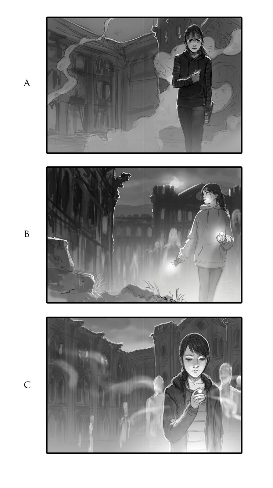
This image is for the book Among Ghosts, by Amber Benson.  I was asked to do an image of the main character, Noh, standing in front of her new school, which is scary and haunted.  She is to be holding an Evil Eye, from which a magical fog is escaping and ghosts can be seen.  It's a wrap around cover and they specifically asked for a burnt dormitory to be on the back cover with ants crawling into it.


So, the first thing I do when starting off a new job and reading all of the provided information is gather inspiration and references.  I spend an hour or so just on google saving images that might be helpful for everything - in this case gothic buildings, burnt structures, gargoyles, and teen girls in hoodies.

Next I prepare some sketches to show the client.  I normally do my sketches in grayscale, but if something relies heavily on color, I will do color sketches.  This is not one of those times.  Since this brief was pretty specific, I only do 3 sketches, but make sure that each one is unique and has it's own special "something" that makes it an interesting
cover.  A lot of times it's easy to have an idea for a cover you really like and then be lazy and do some throw away compositions just to fill space.  I don't recommend this, because more often than not, they WON'T pick your favorite!  It's best to make sure there is something in each sketch that you like so that you don't end up working tens of hours on something you don't like.


The client picked sketch C with minor adjustments.  If there were no adjustments requested or if they are very minor, usually I will just continue to final and that will be the next thing the client sees. However, in this case the client requested another pass for them to see and approve.  This image gives them a pretty good idea of how the image will end up.  This is not an in progress image, but rather just another colored sketch.  I will start over when doing the final image because I have specific steps that I skipped to make this rough image in the interest of time that I will need to go back and do in order to have a better looking final image.


Finally I put the rough draft in the oven and cook on high for 20 - 60 hours depending on the complexity of the image.  And we have a final image!  I made a few adjustments here and there (made the foreground shape on the left more interesting and adjusted the hoodie on the girl), but the client liked them so I was safe.


That's the basic way most of my illustrations go when things go smoothly. When things are not so smooth, there are a lot more revisions.  In concept art, it seems like all you do are revisions!

So if you are still reading, thank you!  I hope that this was informative (probably not) or at least entertaining.  Thank you so much for your attention and thanks to Dan and the crew for having me!

-Jason Chan
Read More
Posted in | No comments

Monster Slayers

Posted on 01:17 by Unknown


Hey everybody

I really loved Jon Fosters article the other day about thumbs. The whole composition element is something that I take more serious than any other thing in a painting. If my thumb works, I KNOW I can make the painting and the final work. If the basic compositional elements are unclear to me, every step from then on is uphill and the end result is so and so.

Seeing all Jons thumbs has made me muster courage to share my thumbs. I need courage, because I feel my thumbs are most sketchy and sometimes unreadable even too me. Well, it is because even thumbs gets abandoned halfway if they feel wrong.


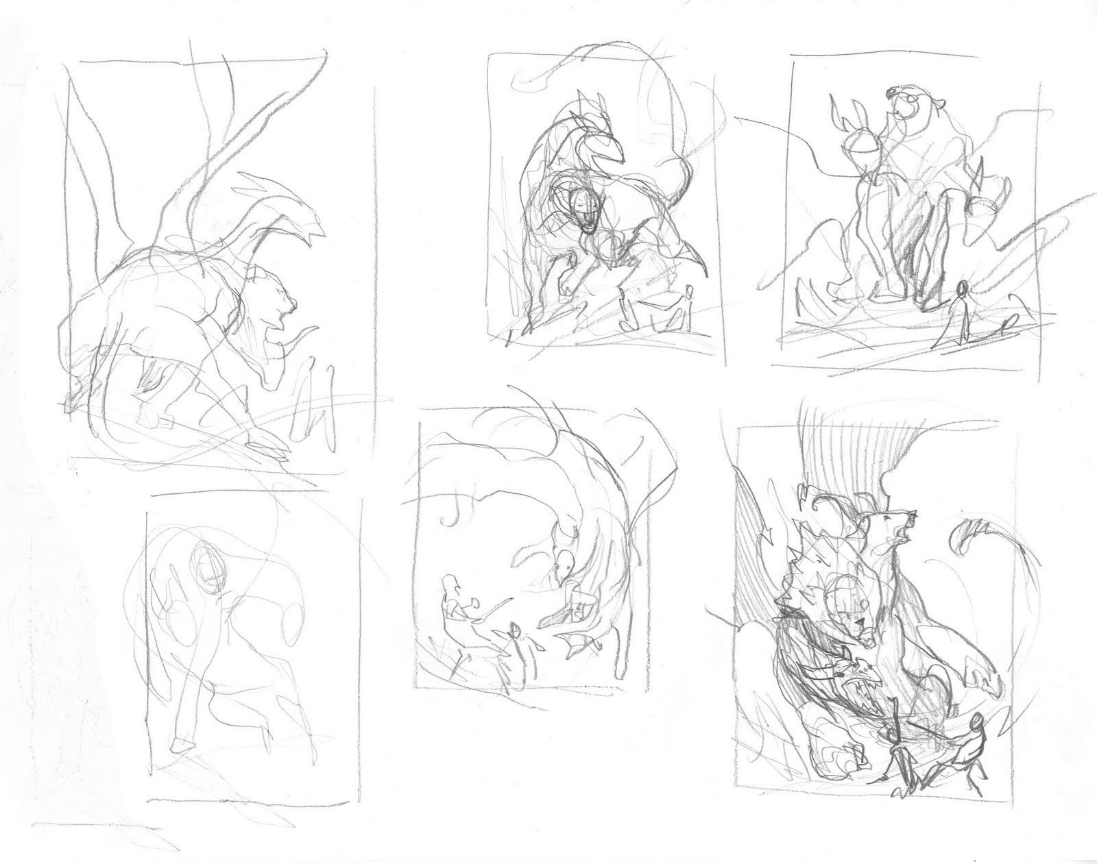
I have collected all the thumbs I could find for a specific cover painting I did for Mirrorstone.

The art assignment was pretty simple: The antagonist, perhaps with friends, facing a Chimera in a cave.

So my sketching concentrated on 2 kind of images: One where the monster was attacking in an aggressive way and one where the monster was threatening the boy in…well, a threatening way.

In the end I fell in love with 2 thumbs: One where the Chimera is diving and about to land in front of the boy, one leg already at the ground. The other where the whole body of the monster was almost framing him, crouching onto him. I was most confident that I could make the framing thumb work the best. So that one I mailed to the art director Kate Irwin.

I marked the ones that I like and those could all have been nice paintings. It is difficult to say why none of the others were picked. All I can say is that to me it is a matter of feeling if I can see the finished painting when I look at the thumb.

On the other hand. If I am in a bad mood that day almost none of the thumbs I do appeal to me and I sketch and sketch without ever being able to hit something worth proceeding on. When I come back the next day, all happy from espresso, and look at the mess I did yesterday, I can see a whole bunch of them that would have been good. I might even go back to the first one. It is really sometimes a matter of a physiological glass half full or half empty.

I define the thumb a bit more before sending it on to Kate. I add grey-tones digitally to show light and values a bit better.

I sketched the boy on a separate piece of paper then stitched it together in Photoshop, move stuff around to avoid tangents and print it out. Then I transfer the sketch to board and ink it. After the inking I scan it again and print out a value version I use for a color rough.


I remember that after I did the background loosely and rough I got exited and wanted to do the figures, I felt bad about pulling the masking film off and starting on the figures before being completely satisfied with the background but thought “What the hell. I will just go back and refine cliffs afterwards”. But when I pulled it off, the rock shapes looked great and in the end I never touched them again.

The whole painting process was only three days, but the sketching and the transferring and all up until I dipped the first brush into color was about 6 days or so.

I used reference for the goat face and the lion.

This picture is going into spectrum 17.


Read More
Posted in | No comments

Monday, 8 November 2010

Dragon Magazine #393

Posted on 21:01 by Unknown
-By Dan dos Santos


This cover just went public a few days ago on the Dungeons & Dragons site, so I figured it would be a good time to share it.


I believe I have only done about 3 or 4 professional digitally... this being one of them. For a long while, I was on the fence about whether or not to start working digitally. I was under the impression that it is much faster and much easier to achieve professional results. And though this may be the case for some... it is not for me.


I found myself repeatedly drawing the same stroke, over and over, trying to capture something that I could have done so easily in real paint. Conversely, there are things that take mere seconds in Photoshop (like dodging) that would take hours to do properly in oils. Ultimately, it seems that a blending of the two mediums reaps the best results.


The combination of my digital incompetence, as well as a severe shoulder strain from sitting at my tablet so long, has quickly convinced me that digital work is NOT for me. I think it's safe to say this is the last time you will see a 100% digital piece from me.


I am also including the original concept sketch which was rejected. It was rejected because the AD felt that it was too violent, and exceeded the magazine's PG-13 limitation for a cover. Personally, I find the original concept more comical than violent, and would actually go so far as to say that the accepted concept is more violent than this one. Though, the deciding factor seemed to be that it was simply implied violence in the new image, since nothing had actually taken place yet.


What do you think?
Read More
Posted in | No comments

Flipping the Switch

Posted on 06:00 by Unknown


Every so often I get asked why I became an illustrator (or, more accurately these days, work in the arts and with artists). My answer is almost always the same: as a kid I was excited by—inspired by—other visual artists and somehow, some way I wanted to do what they were doing. Never mind that I never came remotely close to creating anything as arresting as the works by my heroes, they still inspire me. Their art—and the art by many, many others that have come along (or whom I've stumbled across) in the years since I stopped wearing short pants—still flips that switch in my head and electrifies my imagination. I am absolutely certain every other artist feels the same way and has their own heroes. As for some of the people that grabbed my adolescent attention and have never let go in the decades since? Well...


First there was Russ Heath and his war stories (including "the war that time forgot" that pitted WWII soldiers against dinosaurs) for DC Comics. Heath (who is now 84, I believe) had a meticulous style that I think was unmatched in comics (at least in the 1960s). I always appreciated the stories drawn by Joe Kubert and John Severin (and naturally loved the energy of Jack Kirby and Steve Ditko), but Russ' work was always something that I avidly looked for.


Next was James Bama and his astonishing run of covers for the Doc Savage paperback series—60+ paintings. I always felt like Jimmy was showing me something real and that his characters could literally step off the book rack and beat my butt. Bama also painted the box art for a series of model kits based on the old Universal movie monsters that were also affecting (and which always looked much better than the actual models).


The third was the tag-team of Frank McCarthy and Robert McGinnis, who collaborated on the posters for Thunderball and You Only Live Twice. McCarthy (who also painted posters for The Dirty Dozen and The Train before moving on to become a Western artist—just as Bama did) handled the action scenes while McGinnis painted the vignettes featuring Bond surrounded by a bevy of beauties. I was a little young to understand why, exactly (was it the gadgets or the girls?), but looking at those movie posters made me want to be James Bond. Or, failing that, McCarthy or McGinnis.


Number four was, unsurprisingly, Frank Frazetta. I hadn't noticed his covers for the Ace Edgar Rice Burroughs paperbacks, but his paintings for the covers of Creepy and Eerie magazines and the Conan books hit me like a proverbial ton of bricks. Frank had an intuitive sense for capturing the perfect dramatic moment and, when combined with his cartoonist sensibility, was able to produce works that literally stuck in your head for keeps.


As I entered high school, then college, and finally the professional arena, there were other artists—past and present—that had powerful influences on me, but...you never forget your first love, no matter how much time passes. I'm always interested in finding out who (or what) inspired other artists to enter the field. A visit to a museum or gallery? A comic? A film or book cover or magazine or...?
Read More
Posted in | No comments
Newer Posts Older Posts Home
Subscribe to: Posts (Atom)

Popular Posts

  • Color Roughs
    -By Jesper Ejsing Color roughs are something I put a lot of value in. Colors set the mood. They tell a story as much as the drawing does. T...
  • Eowyn and the Nazgul... Critiques: Round 2
    Thanks for all the kind responses to Friday's crits! Several people mentioned that it is difficult for readers to make comments regar...
  • Idyl - I'm Age
    by Arnie Fenner While thinking about my previous post about art books I'd like to have (and thanks to everyone who added some "want...
  • Deadline!
    The Eowyn vs. Nazgul challenge is due TONIGHT ! More info here .
  • Life After Art School: Five Years to An Illustration Career
    -By Chris Moeller The one emotion every newly-minted art school graduate experiences is anxiety. Can I really make it?  What do I do now?  A...
  • The Black Pharaohs, Part 1
    Gregory Manchess I love working with the National Geographic Society. It tests all of my skills and much of my patience when I work with the...
  • Welcome, Petar Meseldžija
    I would assume that most here are already familiar with the paintings of Petar Meseldzija, as we have made reference to him and his work num...
  • Inspiration: Yugoslavian Monuments
    Kadinjača These structures were commissioned by former Yugoslavian president Josip Broz Tito in the 1960s and 70s to commemorate sites where...
  • Power of the brushstroke
      By Petar Meseld ž ija The painting brush is a simple,   yet powerful device. The trace that it leaves upon the canvas is a wonderful pheno...
  • Robert Fawcett
    by Arnie Fenner Thank God for small presses; fueled almost exclusively by passion and rarely motivated by profit (which is why I buy from th...

Categories

  • Justin Gerard

Blog Archive

  • ▼  2011 (131)
    • ▼  May (19)
      • Eowyn vs. Nazgul... The line up!
      • Tips and Tricks and your suggestions #3 - Workstat...
      • 3-D Art Ready to Print ...Awwwwesome
      • Deadline!
      • A Question of Paper
      • Career Choices
      • Road to Legend
      • REMINDERS!
      • Spotlight On: CHRISTOPHER MOELLER
      • Life After Art School: Five Years to An Illustrati...
      • Robert Fawcett
      • Early Art Hero
      • Power of the brushstroke
      • Welcome, Petar Meseldžija
      • Inspiration: Yugoslavian Monuments
      • IlluXcon 4 Trailer
      • The Black Pharaohs, Part 3
      • New-fangled Water-Mixable Oils vs. Old, Reliable T...
      • Eowyn and the Nazgul... Critiques: Round 2
    • ►  April (28)
    • ►  March (28)
    • ►  February (32)
    • ►  January (24)
  • ►  2010 (65)
    • ►  December (29)
    • ►  November (24)
    • ►  October (7)
    • ►  September (5)
  • ►  2009 (1)
    • ►  August (1)
Powered by Blogger.

About Me

Unknown
View my complete profile