Building Web Site

  • Subscribe to our RSS feed.
  • Twitter
  • StumbleUpon
  • Reddit
  • Facebook
  • Digg

Wednesday, 3 November 2010

This Way or That?

Posted on 06:00 by Unknown
For me, one of the hardest parts of any assignment is the sketch phase.


Early in my career, I alloted myself far too little time to do concept sketches, thinking that because they are so loose I can do them quickly. When in fact, they are the most important phase of an assignment, and often times demand more time than the final rendering. If I rush a concept, I frequently find myself rendering a piece for days on end, all the while knowing that it will never be successful because my plan was flawed from the start. Over the years, I have learned that lesson the hard way... repeatedly. Now, I try to spend a minimum of 2 full days sketching concepts. If it takes me 4 days before I come up with something good, so be it.


When I sketch, I am not only looking for an interesting image, but for something that really captures the flavor of the story. Of course, everyone's tastes are different, so what I find appropriate does not always work for someone else... most importantly, the Art Director.


Over the course of my career, a lot of sketches that I really loved have fallen by the wayside.

Either the AD felt they did not make as strong of a cover, or would not have been as good for sales, or maybe they just didn't leave enough space for type. Whatever the reason, they get rejected, pushed aside for an alternate concept that simply out-shined them on that particular day.


I always tell myself that I will revisit these ideas, but it is very rare that a new assignment comes along where a pre-existing sketch would actually be appropriate for it. So, instead, the sketches sit, as clumps of kilobytes, digital dust-bunnies hiding in some remote corner of my hard drive. For this post, I'd like to dig up some of those sketches, and share with you what some past covers might have been had the AD simply decided to go this way instead of that.


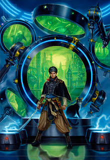


This is the final art and a companion sketch for a novel called 'Doppelgangster'. Both are rather campy and sexy, buy ultimately, I think it was the visual integration of the title that really sold the AD on the chosen concept.


Here is an alternate sketch for 'Implied Spaces'. Since the novel deals a great deal with time travel, I feel the chosen concept definitely captures the story best. Though the mood in the unused concept is a lot more appealing to me and I still regret not getting a chance to paint it.


Lastly, here is a brand new piece for an upcoming Urban Fantasy anthology called 'Naked City'. Fans of Jim Butcher may recognize the guy on the back cover as Harry Dresden, a character which I've had the pleasure of painting 4 or 5 times now for various omnibuses. Below is an alternate concept for the wraparound which wasn't chosen. 


Read More
Posted in | No comments

Tuesday, 2 November 2010

Justin Gerard: Consider Yourself Warned

Posted on 06:00 by Unknown


My name is Justin. I live in America, and I paint for a living. I have a particular interest in narrative-driven illustration and visual storytelling. I will be contributing a number of posts to Muddy Colors in the coming months and I hope that these articles will not bore you to the point where you want to light yourself on fire from sheer eye-numbing boredom. I have read some eye-numbing articles in my day. The kind that are like train wrecks that you can't look away from, but that your brain, in self-defense, just refuses to process.


I will be endeavoring to not put anyone through that, but I can't promise anything. To clarify what I will be going for instead, I have compiled the following short list of topics that you can expect to hear about in upcoming posts of mine:


1. Digital art vs. traditional Art 

2. Narrative-driven Illustration 

3. Mallard Bating 

4. Modern tank warfare 

5. The most mind-blowing images I have seen in my life and why they rock 

6. The practice of being awesome every single day 

7. A new process for taking a digital comp to finished oil painting 

8. A realistic plan for the invasion of Mars


 (Note: While, I am still rather new to #6, the other contributers here at Muddy Colors are not. They are all long-time veterans of it, and I hope to absorb by proximity some of what makes them and their work awesome every single day.)


 I have been involved in the last few years in an ongoing campaign to learn how to paint in oil. When I began working in illustration I worked exclusively in digital. (I was raised largely by video games and digital art is just a next logical next step.) The (digital) work I have done in the past has been featured in Spectrum and seemed well received. Clients were calling and I had plenty of work at the time. Sounds good right? So you may ask, why on earth would I go through the hassle of learning an entirely new medium when I had a perfectly good one right there? Am I deranged? Did I wreck into a tree once when I was a child and damage my brain? Well, maybe; I did hit the tree, and I did hit it with my head. But the truth is that I was after something in my work that I simply could not achieve working digitally. And as much as I enjoyed working digitally, (I love it actually) there was always something that was missing in the final product. And when I looked around at the people whose work I admired the most, (Many of which happen to be here on this blog) I realized that they were achieving this very missing element by working traditionally.


I realized that if I wanted to paint images like that, maybe I ought to stop trying to force digital to try to be something that it wasn't, and just learn how to paint traditionally.

Along the way I have stumbled on some good techniques and many terrible ones, and I learned a lot about the powerful effects possible when combining digital and traditional media to create an image. I also discovered what I feel to be the true strength of digital art and the best way to use it. I hope to share these things in later posts.

This campaign of trying to master oil will be the platform for the posts that I will be contributing to Muddy Colors. Hopefully this will result in something interesting for our readers and also helpful for illustrators who are also learning about the process of visual storytelling. And hopefully it will not drive anyone to self-immolation.


Read More
Posted in Justin Gerard | No comments

Sunday, 31 October 2010

Illuxcon 3

Posted on 21:00 by Unknown


Illuxcon will take place in eleven days. This event is a gathering/convention dedicated solely to the art of the fantastic—bringing artists, students, collectors, and art fans together for an annual symposium intended to inspire and create further awareness and zeal for the field.


As the largest display of original fantastic art in the world, IlluXCon is an entirely unique experience where artists are free to participate in the show just as attendees and students do, students have the opportunity to sign up for private portfolio reviews by industry art directors, and all present have numerous opportunities to be inspired by and grow in love for the vast array of work and people in this incredible field.


Mission:
IlluXCon is dedicated to providing:


...an atmosphere where students, emerging artists, established artists, and masters of the field alike are inspired to take their creative process and work to new heights, make contacts that lead them to new opportunities within the field, and simply rediscover the passion they have for their work and the genre.


...an opportunity for collectors and fans of fantastic art, fine art students and fans, and even those who’ve not considered themselves fans of art before to be blown away by the original paintings and sculpture displayed at the show, while having the opportunity to approach and get to know the talented artists who created the work in a small, art gallery-like setting.


...an environment where the desire to create drives a shared understanding among all present, where egos are checked at the door, where there are no "Guests of Honor," and where the multi-award winning artist takes away just as much from the show as the rookie just learning the ropes.


Illuxcon was conceived by Patrick and Jeannie Wilshire as a way to celebrate the work of the fantastic.


ILLUXCON 3 . . . . . . NOVEMBER 11th-14th, 2010 . . .


Attendance is limited to 200 attendees & 100 students.

There are only a few regular and student memberships remaining. We highly suggest that you contact the Illuxcon website for details.
For more info on registration, click HERE.


Multiple tracks of demos, lectures, & discussions will be posted on the Illuxcon website as the show approaches.


Students will have the opportunity to sign up for private portfolio reviews with industry art directors. We'll contact all registered students with details as the show approaches. Slots will be filled on a first come, first serve basis until all slots are filled.


Be sure to register on the website. And, as soon as you're able to? Buy your tickets for IlluXCon 3!


(NOTE: You need to register for Illuxcon.com before you're able to purchase your tickets for this year's show.)
Details for the event can be found at the Illuxcon link below.


http://www.illuxcon.com/illuxcon2010
http://www.facebook.com/illuxcon


A number of Mudders will be attending Illuxcon and exhibiting their work:


Dan Dos Santos


Eric Fortune


Justin Gerard


Donato Giancola


John Jude Palencar


So come and join us for this wonderful event in the hills of Pennsylvania.
JJP


Illuxcon on You Tube:


http://www.youtube.com/watch?v=iRhinmMPZwI


http://www.youtube.com/watch?v=7D-CFshYw5E


Read More
Posted in | No comments

Thursday, 28 October 2010

Hello, my name is Eric

Posted on 21:00 by Unknown


A little background on what I've been up to. I had spent several years slowly working my way through the illustration field. A few years back, I had an opportunity to show my work in the pop-surreal/low brow gallery scene. I took the red pill...or was it the blue pill? I took some pills and jumped in with both feet.


My art has been kicking my ass ever since. There's been a lot of experimenting, a lot of mistakes, and a lot of pushing myself to be better than I was the month before. Getting better everyday is just too much to ask for. There's a real ugly side to my work. Mostly the 80% that resides between starting and finishing. It's full of doubts, insecurities, a lot of choices, and a lot of muddy colors. Every painting is a difficult journey. If it were easy I wouldn't appreciate the end nearly as much. Mistakes are fine. Failing is okay. Learning from these experiences and getting back on the easel is even better. From here on we hope to imbue you with a little insight into the thoughts and processes of our work.


A recent journey has lead me to this painting which is part of an upcoming show opening Nov 6th at LeBasse Projects Gallery.
Read More
Posted in | No comments

The Mud of Venus, Part 1

Posted on 05:55 by Unknown


"I can paint you the skin of Venus with mud, provided you let me surround it as I will."

- Eugene Delacroix

A perfect statement to start off my presence here at Muddy Colors.

Delacroix compressed a great deal of art theory into that one sentence, and the most profound for me was that color is all about relativity. What clump of 'mud' you place next to another clump will impact all your color decisions thereafter; cool/warm relationships begin to evolve when even the subtlest of differences are managed between color and form. Nearly every painter comes to this revelation some point in their career, and the sooner the better!

The need to call upon the massive weapons of 'exaggerated-complimentary-color' to solve a problem is not always what is called for in an image. Many times the poetic harmony of similar values and hues
can deliver your message with greater clarity. I have certainly used both methods to great success over the years and evaluate each new project to determine what color system may best work for me to resolve the pictorial constraints of a new commission. There is no right nor wrong way to approach color, and as N.C.Wyeth and Monet have shown, exaggerated color can certainly be used with mind-blowing effectiveness.


But I want to talk about 'mud'.

From muddy cool reds to dirty warm greens, all of this can become the stuff of flesh and Venus. I think Delacroix had boasted with such bravado about his virtuosity with paint because he already knew that to paint flesh, an artist is really manipulating a bunch of mud! For next to any hue, a subtle shift cooler will allow any tone to appear warm. It is from these temperature (and value) changes that we infer mass and shadow as they play themselves out over a form. The slower and smoother these transitions, the softer and more diffused the light. It is for this reason of working with 'mud' that I am never able to answer the question -
'What colors do you use for your skin tones?'
For in its asking, I respond with questions of my own- what kind of skin are we talking about, Caucasian, African, Indian, etc...? Lighting effects? Source light color? Reflected surface colors? Overall saturation of the painting? Environmental concerns? Opaque vs. glazing techniques? etc... All of these and much more go into the choices made about skin tone. There is never a concrete answer nor singular starting point for generating these colors. It is all relative.

But a decision must be made in the painting process about where to start - what first dab of color to begin with. When I have made this commitment, usually through a color study or example I have found in another work of art or photograph, I am ready to create my 'mud'. From lights to darks, warm to cools, I attempt to blend and mix a full range of values and hues on my palette based upon observations with my model/reference and what color scheme I wish to bend towards. Rather than create a single string of blended color, I create a large puddle of mud, painting the model from lights to darks as if the model melted into a pile of mud. This is all without cleaning my brush to facilitate the neutralizing of intense colors. Beginning with a 'dirty' neutral tone created from umbers, reds, whites and ochres, I then expand out producing a line of darker and warmer tones. Parallel to that range, I create a similar cool string and then blend a portion of these together. A mirror image of these cool/warm strings plays itself out into the lighter tones.
This method provides plenty of paint on the palette ready to sample from with the option of warm and cool hues of varying values surrounding nearly any selection from this puddle. In the end I have arranged a complex color wheel constructed around paint I will use in the flesh and surrounding areas of the figure. A total mud pit! I invariably make modifications to this mixture, but find it a wonderful resource pool to dive into during the painting phase, without much worry about trying to remix the 'exact color' you just ran out of, because you never had any pure color to worry about. These mud colors also prove to be excellent sources for testing out background colors and values, as the test originates from a tight range of balanced relationships, and a sample from this source easily harmonizes the whole image.


Having read Delacroix's quote when I was a young painter, its insightful meaning could only be fully grasped after I had spent years discovering the truth in painting with mud for myself. I hope it comes sooner for many of you!


My next post will deal with the other insightful observation from Delacroix's statement. Until then..

Happy mud slinging!

Donato
Read More
Posted in | No comments

Wednesday, 27 October 2010

Syreian the Bonecarver

Posted on 01:22 by Unknown
Hi everybody,

Before I get startet I think I need to introduce myself and apologize. The apology is for my bad mouth and poor English skills. I am from Denmark and English is only my second language. I was taught English in school, but mostly I learned it from from hip hop lyrics and old Clint Eastwood movies. So cut me a little slack if I sometimes sound like an aggressive, ignorant fool or an extremely impolite asshole. I assure you I am not an asshole.


I am Jesper Ejsing. I am a fantasy nerd. Ever since I played DnD for the first time I made the genre my own. When I read Lord of the Rings a whole new world opened up to me and I jumped right in.


Today I am glad I never listened or cared for the voices that told me to start drawing something else. ”When are you going to paint something serious, Jesper? And not just those big-boobed fantasy babes of yours?” Haven´t stopped yet and the practise, or stubbornness, has paid off.


I never wanted anything else but to draw and paint these scenes from a world that exists only in the minds those who play these games. I have been playing roleplaying games for so long that I almost feel like a resident of a medieval-like fantasy town. Or at least a regular visitor. When I illustrate things taking place there, I draw from memory or experience. Not artistic experience, but game experience, and I feel that is one of my strongest assets. I portray fantasy with an honesty, if nothing else. That is my humble mission. I think I succeed in one out of ten paintings.


Today i want to share with you a World of Warcraft card I did for Blizzard a year ago. Even if the illustration is somewhat classic and even naive, it represents a new beginning for me. I am perfectly aware how extremely stupid this sounds. Looking at the babe illustration you can only wonder what kind of a sad, simple mind Jesper has when he says it represents a new beginning, but let me explain...:


I have been doing these kinds of illustrations for so long that I finally became bored of them. Mean-looking dudes and babes with lots of weapons, ready to go; in every way, violently or sexually. I needed a new angle to make it interesting to myself again. But I didn´t want to change styles or anything. I decided that I wanted my characters to look more believable. Not naturalistic, that is certainly not for me. But more like a type, a real person, instead of just the ordinary Class A Barbarian. I began looking at H&M catalogs for small details like light under eyes, strands of hair or shapes of noses. Elements that would pull me out of my comfort zone. I also wanted the expressions to be more than just pornstar lips for women and clenched jaws for men.


This WOW character is the first one I did where I felt the face and the expression has something more than just looking cool. She has a small twist to the lips and a danger in the eyes. This may sound like something you learn the in the first semester of art school: Well I never went, and I only discovered this or realized that you could even do this, a years or so ago. Happy me... and why didn´t anyone tell me this from the start?


Anyway, I will show you the sketch and the final art work. The sketch has values added in Photoshop. I do this mostly for the art director - so that he can see the light and the shapes more clearly. Also it helps me figure out the values before I start painting. Having made you read all my sentimental ramblings about growing as a person, I would just ask you to be patient with me for a couple of moments longer. Notice the difference between the face from the sketch (clearly comical) and the final (more naturalistic; no that is not it... more believable; nah...well... better! Alright?)


It is acrylic on watercolor paper.


Read More
Posted in | No comments

Tuesday, 26 October 2010

Dan Dos Santos: On the Importance of Being Stupid.

Posted on 06:00 by Unknown
Welcome to day two of the 'Muddy Colors' blog!


I still don't know quite how I managed to do it, but I somehow convinced what I consider some of the best Artists in the industry to join me in creating this blog. A blog which guarantees to take their already packed work days and stuff them even fuller with deadlines, tech-savvy shortcomings, and even a little self-doubt. And in return for all their hard work... the risk of public humiliation. Yet despite all of that, everyone still generously said 'Yes.' Proving they are not just some of the most talented people I know, but some of the nicest as well. For this, I am truly grateful, and extremely proud to call them my friends. I don't know how long it will be until this experiment blows up in our faces, but until then, we promise to have something new for you guys every single weekday. So please, check back in regularly!


For what is technically my inaugural post, I'd like to briefly show off a new painting I just finished, and talk a little about what is quickly becoming one of coolest series I get to work on.


Daw books contacted me a little over a year ago to do the cover for a book called 'Touched by an Alien", by Gini Koch. The story revolves around a woman named Katherine (Kitty) Katt, who fights along side Armani-clad (and drop dead gorgeous) Alpha Centurions to defend the Earth from hostile alien invasion. The story is packed full of sex, violence, and surprisingly... humor.


Sex and violence? No problem! I've done a lot of that in my covers. But capturing humor was something that never came up, and quite honestly, scared me a little. This wasn't slapstick or something else that could be brashly depicted. It was a subtle campiness that pervaded the book, and really brought a lightheartedness to an otherwise intense story. Capturing this flavor was something I had little experience in, but I knew it was essential if this were to be a good cover.


After struggling for a while with the initial sketches, I ended up finding inspiration in movies like 'Army of Darkness' and 'Men in Black'. It occurred to me when watching these movies that I never actually feared for the safety of the heroes. I knew they would succeed, no matter how ludicrous and over-the-top their situation was. Why did I know that? Because they knew it. And therein lay the solution to my problem... stupidity. Nothing says 'campy' quite like an imbecilic lack of fear in the face of obvious danger. The more danger there is, the more fun it is.


This series of covers quickly became proverbial kitchen sinks; chock full of monsters, aliens, guns, exploding cars, clones, and even crocodiles?! I distinctly remember sitting at my easel in the early morning hours, really tired, painting this crocodile and asking myself "What the HELL am I doing right now?" Yet in retrospect, I wouldn't like the painting half as much if it weren't for that cute little guy. It seems the more I stuff in there, the better they get. Not only does this make the images more exciting to look at, but it makes for a really fun painting experience. The other nice thing is that it allows me to add a slew of narrative elements from the book. Elements, which I hope readers will pick up on as they come across them in the story.


The most recent addition to the series is "Alien in the Family". The book won't be out for sometime yet, so I can't mention the epic intergalactic bloodbath... But suffice it to say, it was super fun to paint, and promises to bring me yet another really cool painting to work on in 2011.


Oils on board, 20x30 inches.


Read More
Posted in | No comments
Newer Posts Older Posts Home
Subscribe to: Posts (Atom)

Popular Posts

  • Color Roughs
    -By Jesper Ejsing Color roughs are something I put a lot of value in. Colors set the mood. They tell a story as much as the drawing does. T...
  • Eowyn and the Nazgul... Critiques: Round 2
    Thanks for all the kind responses to Friday's crits! Several people mentioned that it is difficult for readers to make comments regar...
  • Idyl - I'm Age
    by Arnie Fenner While thinking about my previous post about art books I'd like to have (and thanks to everyone who added some "want...
  • Deadline!
    The Eowyn vs. Nazgul challenge is due TONIGHT ! More info here .
  • Life After Art School: Five Years to An Illustration Career
    -By Chris Moeller The one emotion every newly-minted art school graduate experiences is anxiety. Can I really make it?  What do I do now?  A...
  • The Black Pharaohs, Part 1
    Gregory Manchess I love working with the National Geographic Society. It tests all of my skills and much of my patience when I work with the...
  • Welcome, Petar Meseldžija
    I would assume that most here are already familiar with the paintings of Petar Meseldzija, as we have made reference to him and his work num...
  • Inspiration: Yugoslavian Monuments
    Kadinjača These structures were commissioned by former Yugoslavian president Josip Broz Tito in the 1960s and 70s to commemorate sites where...
  • Power of the brushstroke
      By Petar Meseld ž ija The painting brush is a simple,   yet powerful device. The trace that it leaves upon the canvas is a wonderful pheno...
  • Robert Fawcett
    by Arnie Fenner Thank God for small presses; fueled almost exclusively by passion and rarely motivated by profit (which is why I buy from th...

Categories

  • Justin Gerard

Blog Archive

  • ▼  2011 (131)
    • ▼  May (19)
      • Eowyn vs. Nazgul... The line up!
      • Tips and Tricks and your suggestions #3 - Workstat...
      • 3-D Art Ready to Print ...Awwwwesome
      • Deadline!
      • A Question of Paper
      • Career Choices
      • Road to Legend
      • REMINDERS!
      • Spotlight On: CHRISTOPHER MOELLER
      • Life After Art School: Five Years to An Illustrati...
      • Robert Fawcett
      • Early Art Hero
      • Power of the brushstroke
      • Welcome, Petar Meseldžija
      • Inspiration: Yugoslavian Monuments
      • IlluXcon 4 Trailer
      • The Black Pharaohs, Part 3
      • New-fangled Water-Mixable Oils vs. Old, Reliable T...
      • Eowyn and the Nazgul... Critiques: Round 2
    • ►  April (28)
    • ►  March (28)
    • ►  February (32)
    • ►  January (24)
  • ►  2010 (65)
    • ►  December (29)
    • ►  November (24)
    • ►  October (7)
    • ►  September (5)
  • ►  2009 (1)
    • ►  August (1)
Powered by Blogger.

About Me

Unknown
View my complete profile